Outfront Media / MTA Map Experiments

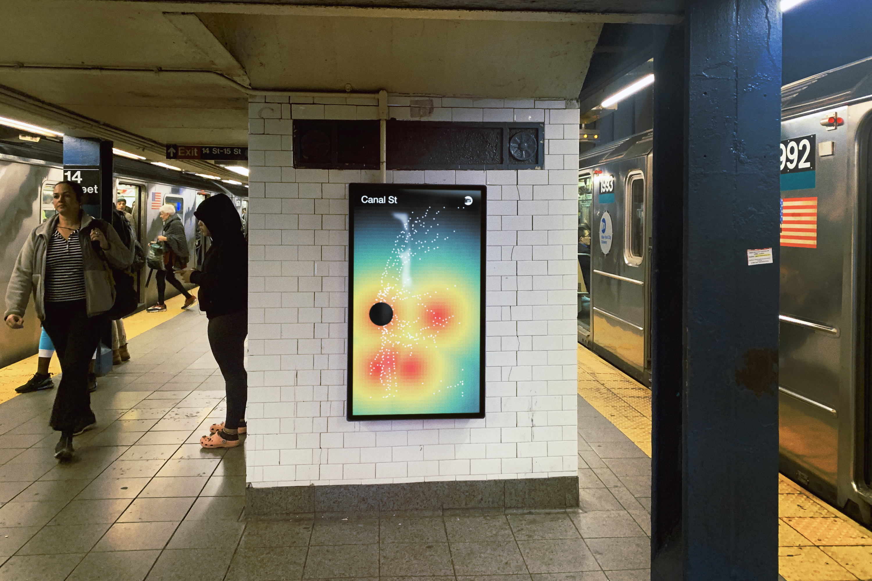
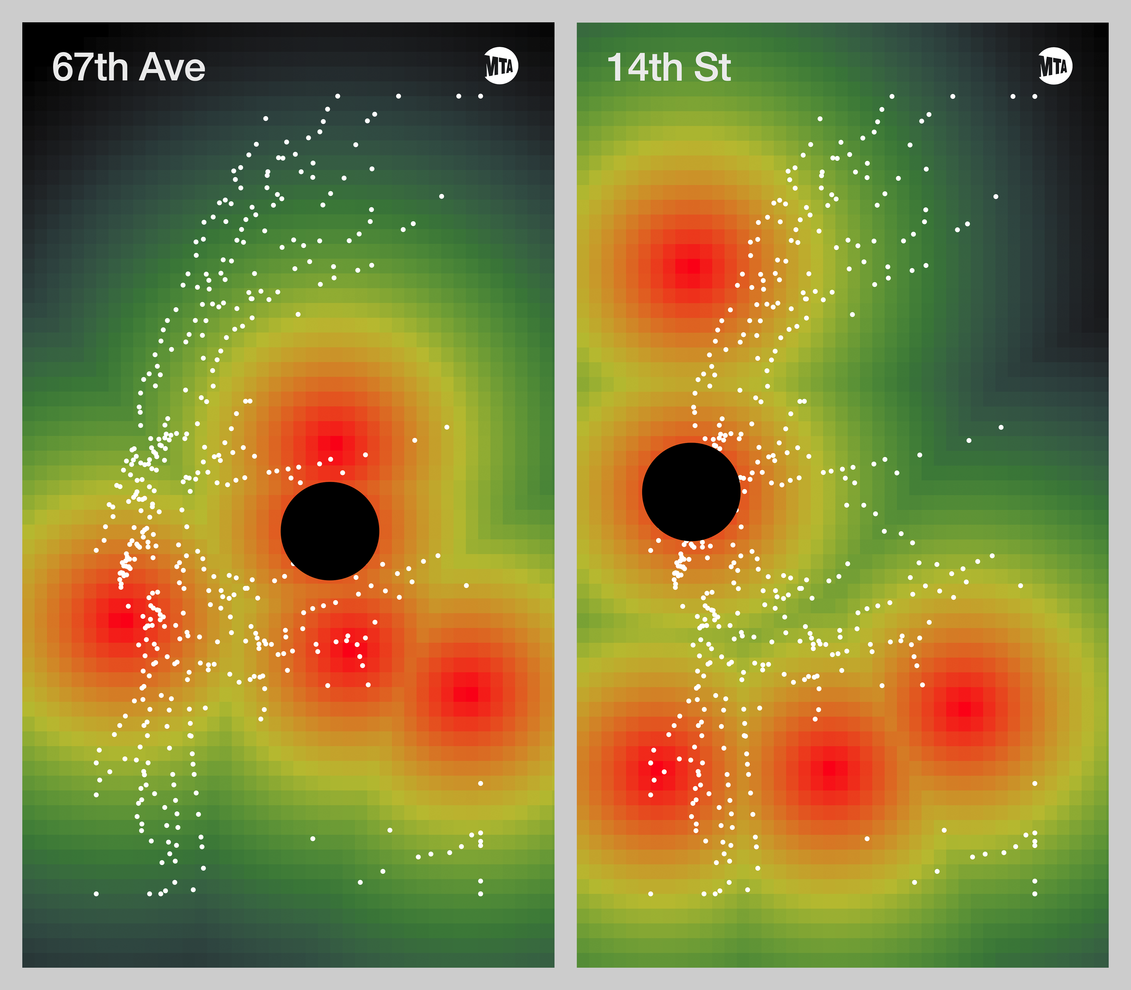
Visual experiment of a dynamic MTA subway map. Using Outfront Media's Live Boards, the application uses p5.js to illustrate hotspots in the transit system.
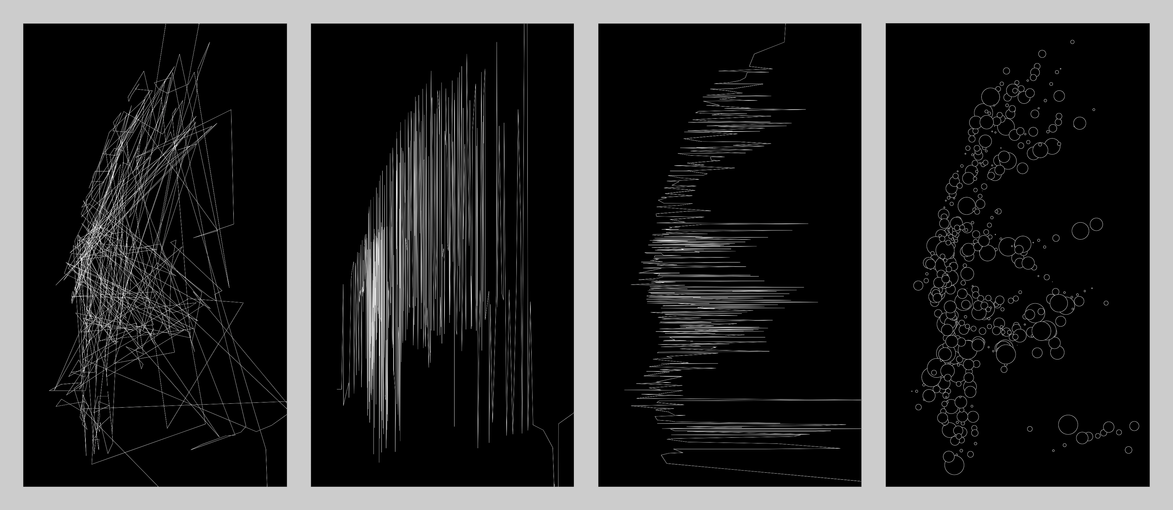
Creating drawings using GeoJSON of all 472 NYC subway stations.

What would it look like to plot heat maps of activity within the subway system?

Arx
Website
2021
sksksks
Website
2021
Camp by Walmart Activity
Interactive Video
2020
p5snap
Developer Tool
2020
Phase Mask
Live-Coding Environment
2020
Roddy Schrock
Website
2020
FZT-8050
Interactive Installation
2019
Leandra Medine x MANGO
Interactive Retail Display
2019
NYE Wonderville Algorave
Algorave Performance
2019
Outfront Media / MTA Map Experiments
Experimental Design
2019
Pim Ketras
Machine Learning
2019
Slime Futures
Multimedia Sculpture
2019